The 8 Steps To Creating A Great Storyboard
Google Ventures’ Jake Knapp takes us through the lightning-fast process he employs to get a team’s ideas down on paper.
At the Google Ventures Design Studio, we have a five-day process for taking a product or feature from design through prototyping and testing. We call it a product design sprint. In the first two days of the sprint, we’ve learned about the problem, shared a lot of knowledge, and chosen the challenge we want to tackle in this sprint. It’s time to start cranking out solutions. Expect this step to take between two hours and all day.
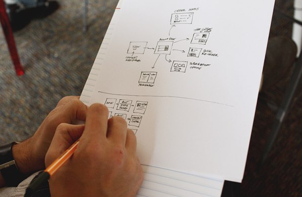
I call this step “diverge” because when everyone (from the CEO to the marketing manager) is cranking out quick sketches, we tend to get a lot of ideas–and different kinds of ideas. Remember in the Legend of Zelda how the map would light up rooms you had visited as you explored the dungeon? That’s what you’re doing on Day 2: illuminating all of the possible paths.
Although you’re going to be generating ideas, don’t think of this as brainstorming–at least not the everybody-is-shouting kind of brainstorming. Instead, everyone in the sprint will be working quietly and individually, often around the same table. The exercises outlined below force you to get ideas out of your head and onto paper, without getting stuck feeling like they have to be finished or perfect.
DUST OFF THOSE OLD IDEAS
In my experience, some of the best ideas that come out of sprints were usually around before the sprint started. It’s not that they were bad ideas; they just hadn’t gotten enough love yet. The sprint gives you a chance to put all solutions on a level playing field. If you don’t bring out your pre-existing ideas, you do yourself a disservice.
Because new ideas are so shiny and fresh, the facilitator needs to remind everyone to think old first. There’s no need to be embarrassed of that solution you thought of five months ago while eating a burrito or taking a shower.
PAPER FIRST
One problem with business-as-usual-design is that companies get in the habit of going straight to high-fidelity mockups. In a design sprint, we start designing on paper for a number of reasons:
• It’s faster.
• Everyone can contribute (not just designers).
• Nobody gets too attached to the ideas that are generated because they’re so quick and rough. We purposefully use thick markers to make sure nothing gets too precious.
• Did I mention it’s faster?
• Everyone can contribute (not just designers).
• Nobody gets too attached to the ideas that are generated because they’re so quick and rough. We purposefully use thick markers to make sure nothing gets too precious.
• Did I mention it’s faster?
Run the series of exercises below to guide everyone from note-taking through sketching and sharing. See my earlier post for an exact list of the materials you need. I use my trusty Time Timer so everyone can see how much time is left in each exercise.
When I’m facilitating a sprint, I like to remind everybody that we’re not going to share any of the materials until we make storyboards–that’s step five of the cycle–and they’ll have plenty of time to polish those up. I want to make sure everybody feels loose and knows they’re actually going to have plenty of time to work, even though we’re keeping time as we go.
1. CHOOSE PART OF THE PROBLEM
In Day 1, you drew a user story diagram. Look at it together as a team. If the user story is more than two steps long (and it probably is), you’re going to need to divide it up before you start sketching. This is as simple as finding natural chunks in the story and drawing a box around them, like this:
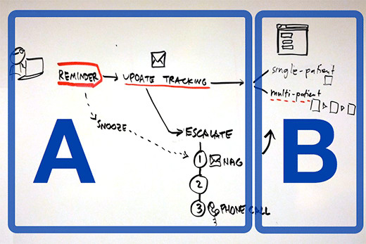
Now decide which part to focus on first. It usually makes sense to have everybody in the sprint focus on the same part of the problem at once. If you take that approach, you’ll do one cycle for each part of the problem, with everybody collaborating on each part as you go.
You can also divide and conquer–everybody picks a piece of the story they’re interested in and works on that. This way is usually faster, although it introduces the risk that people don’t think about the user story holistically. If you have more than two or three chunks in your story, you might have to divide and conquer, or perhaps decide you’re going to focus on a smaller part of the problem for this sprint.
Either way, the facilitator ensures that everybody knows which piece of the user story they’re focusing on before you continue.
2. TAKE NOTES (5 MINUTES)
At this point in the sprint, the whiteboards and walls are probably covered in diagrams, notes, and “how might we” sticky notes. This is your chance to reload that stuff into your brain. Everyone takes a piece of paper and jots down anything they think is useful.
3. MIND MAP (10–15 MINUTES)
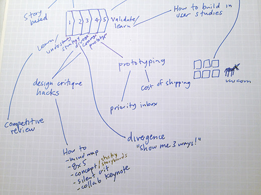
Now you’re going to add all the other ideas that are in your head, mix them with the notes you just took, and loosely organize them on paper. The mind map is going to be your “cheat sheet” you can use when you’re sketching UI ideas.
If you’re not familiar with mind mapping already, I often describe it as writing down everything in your head with no specific formatting; or quiet individual brainstorming. You can write words and connect them or not, you can draw pictures or not–you basically can’t do it wrong. The important thing is that everyone is getting every solution, old and new, out of their head and onto paper at very low fidelity.
Here’s an example:
4. CRAZY EIGHTS (5 MINUTES)
Everybody folds a blank sheet of paper in half four times, then unfolds it, so they get eight panels. Then you have five minutes total to draw eight sketches, one in each panel. Yes, you did the math correctly, that’s about 40 seconds per sketch, which is crazy…but it’s a great way to crank out variations of ideas quickly. And since these aren’t shared with the group, there’s no need to worry about making them pretty.
Since you have only 40 seconds for each drawing, you’ll need to turn off the self-editing and just get your ideas on paper. Crazy Eights will also help loosen up your creative muscles and make you more productive in subsequent sketching exercises. If you get stuck, try repeating an earlier sketch with a small variation– this type of exploration is useful and it keeps you moving.
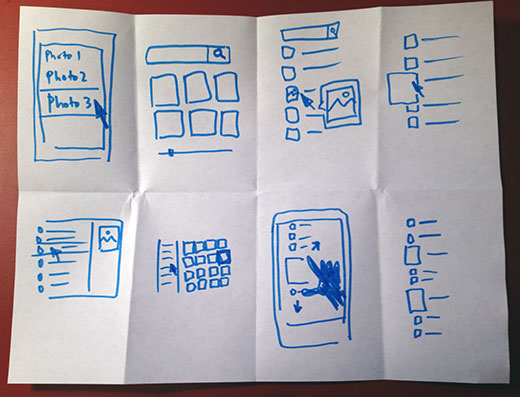
For best results, do two rounds of Crazy Eights. On the second round, everyone will have the hang of it. You’re scraping the bottom of the barrel, which makes it more painful to come up with new ideas, but often this is where the most interesting solutions come from.
Now you may be thinking, I’m a bit of a hypocrite: Earlier in this post, I said old ideas are best, and now I’m asking you to come up with new ideas. Don’t get me wrong, it’s OK to fill out your Crazy Eights sheets with old ideas. But new ones are good too–just because old ideas tend to be stronger doesn’t mean they always win.
Pro tip: Get the Bit Timer app for your iPhone and set it to 30-second work periods and 10-second rest periods for eight reps, so you don’t have to time it yourself. The rest period alarm acts as your 10-second warning to wind down your current sketch. (Crazy Eights are based on the 685 exercise introduced to us by Brynn Evans.)
5. STORYBOARD (10–20 MINUTES)
Now we’re going to make that user story diagram more concrete, and we’re going to make something that will be shared anonymously and critiqued by the group. The goal is to take the ideas we’ve generated so far and sketch an actual UI showing how a user would move through this part of the story– where they click, what info they enter, what they think, etc.
Start with a blank sheet of paper, and put three sticky notes on it. Each sticky note is one frame in the storyboard. It’s kind of like a comic book that you’re going to fill in. Look back at your mind map and your Crazy Eights and find the best ideas. Chances are, you’re itching to illustrate at least one of them in more detail. Now you’re ready to rock. I ask everybody to draw UI in the three frames of their storyboard showing a progression: first this, then that, then that.
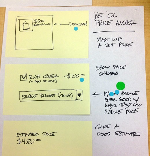
There are three important storyboard rules:
• Make it stand alone: Just like a real product, your drawing has to make sense by itself, without you there to pitch it. In the next steps, people will be looking at these, but you won’t have a chance to talk about your idea until the end.
• Keep it anonymous: Don’t write your name on your drawing. You’ll want all ideas to start on a level playing field and it can be distracting to know which one was drawn by the CEO.
• Give it a name: Come up with a catchy title for your idea. That makes it easier to discuss and compare later.
When you finish the storyboards, hang them on the wall with some sticky stuff. Pro tip: Hang them side by side (like an art museum) so people won’t have to crowd in too tight to see them.
6. SILENT CRITIQUE (5–10 MINUTES)
Give everybody a bunch of dot stickers. Then, without speaking, everybody looks at the different storyboards and puts a sticker on every idea or part of an idea they like. There are no limits to how many stickers you can use, and I don’t even prevent people who want to brazenly vote for their own ideas. By the end, you’ve got a kind of heat map, and some ideas are already standing out.
7. 3-MINUTE CRITIQUES (3 MINUTES PER IDEA)
Next, everybody gathers around the storyboards one at a time. First, people talk about what they liked, then we ask the person who drew it if we missed anything important. Usually the best, most popular ideas are the ones people can understand without an explanation, so the author of the storyboard often doesn’t have anything else to add. This process works far better than letting people explain their ideas first–which almost always uses up a lot of time.
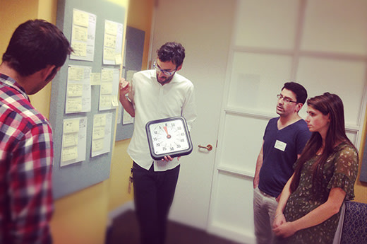
Sometimes I like to do this step on a projector, especially if there are a lot of ideas to get through. I’ll take photos of each storyboard on my phone, upload them to Dropbox, put them in a Keynote file, then make notes about parts we like with outlines and text labels as we go through on the projector. This is easier for everyone to see, and you have a digital artifact of the ideas for later. The downside is the setup: Count on 15 extra minutes to capture and upload photos.
8. SUPER VOTE (5 MINUTES)
Once we’ve looked at all the ideas, everybody gets one or two “special” stickers (which can be the same dot stickers from before with a pen mark on them). These are “super votes” for the ideas you think are the very best. Between the original heat map and these super votes, it’s very easy to see which are the strongest concepts.
The super votes offer a unique way to tweak the process to reflect the decision-making structure of your team or company. Does your CEO make all final decisions about the product? If that’s the case, be honest about it and give her three super votes and everybody else one. Or maybe it’s a UX director or maybe a tandem of product and design who call the shots. The simple rule is to give the deciders extra votes.
By default, this process will be a meritocracy, but that’s not always the way companies work, and frankly, consensus can lead to poor design decisions. The last thing you want are decisions that the deciders don’t truly support. On some teams, these may be unwritten rules, so don’t be surprised if it feels a bit awkward to bring it up–in the long run, you’ll be glad you did.
REPEAT
Now it’s back to the first step to start the whole cycle over again. (Don’t worry, it gets easier with every repetition.) If you split up the user story last time, it may be time to move on to another chunk. Often when I’m running a sprint I’ll realize at this point that our scope was too large, and we should just double down and keep working on the same section. Either way, the end of a cycle is a good time to take a few minutes and carefully decide where to focus next.
Expect a team to be able to do this cycle two or three times in a day before getting burned out. Throw in plenty of breaks and snacks to keep the troops moving.
Stay tuned for the next episode, where we’ll talk about how to decide which pieces of these storyboards go into your prototype.

No comments:
Post a Comment